Home Science Page Data Stream Momentum Directionals Root Beings The Experiment
We now have a Data Stream. We have a box to separate events from non-events. Criteria. We have a way of attaching a number to an event, which is based upon a regular time interval. Duration. The only other ingredient that is needed to have a Data Stream is to order the data points. A Data Stream is an ordered set of numbers that happens to be growing. (To compare Data Streams, they must span the same time zone with the same time increments.)
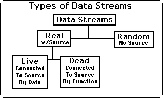
There are two main classifications of Data Streams, Real & Random. A Real Data Stream has a real world connection; hence there is a Source it was derived from. A Random Data Stream has no Real World connection, hence has no Source.
Real Data Streams are connected to a Source. There are two types of Real Data Streams – Live and Dead Data Streams. Dead Streams are totally predictable. They are definable by functions. Once the defining function is known only one piece of Data need be known to accurately predict the rest of the Data. The function reigns supreme while the Data is secondary. The Dead Stream is connected to the Source by a function, thus the actual data doesn't matter after the function is discovered. This is why we say that the God of functions rules Dead Data Streams. Live Data Streams can't be defined by functions. Live Data Streams are discontinuous. No function can define them so their Data reigns supreme. Many scientists have ignored Live Data Streams, or pretended that they don't exist, because of their inherent spontaneity, hence unpredictability.
See the chart below for the types of Data Streams and notice the hierarchy.
Scientists that worship the God of Functions, spend their lives searching for functions that will define Data Sets or Streams. They seek to Kill Live Data Streams by breaking them into Dead Sets or by roping them with functions. If, however, Live Data Streams are to be studied in their own right, then the study of functions must cease and the study of data interactions must commence. To study the behavior of Life, one must worship the God of Spontaneous Life.
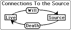
The Live Data Stream is connected in 2 ways to its Source. One way is through Death and the other is through Will. Death in this case is anything from the outside, which changes our subject's data, and causes him to veer. This effect goes from the outside in. The other way is from the inside out. We call this Will. Here the subject causes his Data to change, to veer, by force of Will. In Death, the subject is forced to change his Data Stream from the outside. With Will the subject changes his Data Stream from internal motivations. {See Live & Dead Data Sets Notebook for more information.}
As every self-respecting experimenter knows there is one more way that change in a Data Stream could occur, which is separate from the Source. The experimenter could change the way he collects Data. He could make his Box bigger or smaller, intentionally or inadvertently. If it is intentionally, it should be noted. We worry about the inadvertent shifts most of all. We are going to assume that most experimenters have integrity, but because they are human we will assume that they might inadvertently gradually shift data taking procedures over a large period of time. When viewing long-term data collection, one must take subconscious changing of criteria into account.
To set up a Data Stream first the Experimenter needs Data. To get Data for a Stream, the Experimenter needs three ingredients. First comes the Polarity, i.e. what the Criterion is based upon. It is necessary to set up an Is and an Isn't. Second comes the Quantification of the Polarization. The experimenter must decide how to determine how much Is there is, and conversely how much there Isn't. Third comes the setting of the Duration of the Data readings. How often is the Experimenter going to take a reading. Add these three elements together and you have a piece of Data. Add two pieces of Data together and you have a Data Stream. With every Data Stream comes measures of central tendencies, among which are Averages, Means and Medians. We will be employing more exotic types of central tendencies based upon Decay. Central Tendencies are independent of Source. Because they are derived wholly from the Data Stream they are totally dependent on the Data Stream.
These data-dependent source-independent characteristics are most often referred to as central tendencies because they describe how the Data hangs to the middle of the Stream. As soon as two bits of data are thrown into the box, the stream acquires all sorts of central tendencies. In this Notebook, we will focus upon the traditional Mean average. Another data-dependent source-independent characteristic of Data Streams are measures of Variation. In this Notebook, we will focus upon the Standard Deviation. With just a few readings the central tendencies and measures of variation have very little stability. Hence they have very little momentum. This is to introduce the concept of Data Stream Momentum. We will discuss this much more later on. First let us look at some equations that will prepare us for a discussion of impact, which will lead to a notion of stability and then finally momentum.
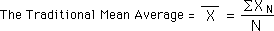
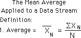
The traditional Mean Average of a set of Data is the sum of all the Data in the set divided the number of Data Bytes in the set. This is shown in the equation below.
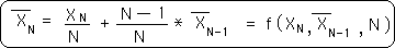
Now we apply this definition of Mean Average to a Data Stream. Remember that a Data Stream is always growing, unlike a Set, which is fixed. Because it is growing its number of elements is always growing and hence its Average is always changing. We define the Nth average of a Data Stream in the exact same way that we define the Mean Average of a Data Set with N elements. Our Mean for the Data Stream has a subscript, however, because it is only relevant for that point. This is shown below.
This is a content-based equation. The measure is found by summing all the elements, the content, of the Stream.
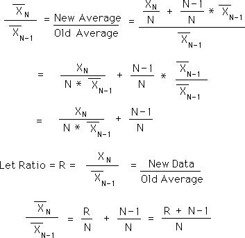
Let us look for a context-based equation for the Mean. Let us start by looking at the Mean for the N+1 Data Byte. Applying the equation above, the new average after the next Data Byte, Xn+1, would be:
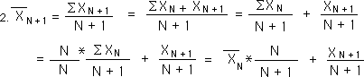
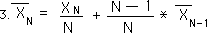
Using this equation, we could rewrite the Mean Average in the context-based equation below. Here the context is the previous average, which contains everything that went before. It is diminished a bit to accommodate the increase in N. One does not have to know all the other Data Bytes that went before, only the Prior Mean Average to get the New Average.
The difference between two consecutive averages in a Data Stream is also going to be a crucial concept, related to acceleration.
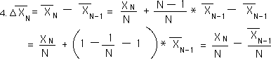
Above are some substitutions and algebraic manipulations, which will lead us to the contextual equation for this Change in Means, found below.
The contextual equations for the Mean average and the Change in Means have the exact same elements arranged in different ways. We will see these Equations 3 & 5 again.
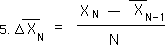
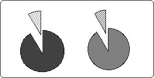
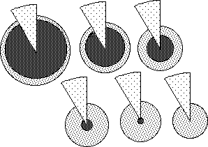
Traditional physical momentum has to do with the inertia of a physical system, the system's resistance to change. Data Stream Momentum has to do with the resistance its central tendencies to change. In order to understand this resistance to change, first, we will visually look at the potential impact of the Nth Data Point upon the traditional Mean Average. As seen from Equation 3 above the real impact of the Nth Data Point upon the Nth Average would be equal to its value divided by N. Its potential impact on the Nth Average would simply be 1 divided by N, the number of elements that make up the average. This is visually demonstrated below. The whole pie represents the Nth Average. The small wedge shaped piece represents the potential impact of the Nth piece of Data upon the Average. When N is 3, the first pie, the potential impact of the Nth Data is one third. When N is 20, the 2nd pie, the potential impact of the Nth Data is one twentieth. When N is 100, the 3rd pie, the potential impact of the Nth Data is one hundredth. It is easy to see that as N becomes larger and larger that the potential impact of the Nth piece of Data becomes smaller and smaller.
Therefore the smaller N is, the less stable is the Average. Conversely the larger N is, the more stable is the average. When N is 100, the average is very resistant to change; hence its momentum is much greater than an average based upon only 3 pieces of Data. These findings are independent of Data size. Thus N is the first factor that influences the stability, hence the momentum, of the Mean Average of our Data Stream.
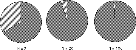
The Pie Graphs below illustrate the exact mechanism that takes place when a new piece of Data is added to a data set to form a new average. The first pie represents the new piece of Data in our Stream. The second pie represents the Average of our Stream before the new Data is added. To get the new average first subtract out the piece from the second pie and replace it with the piece from the first pie. This is represented in the third pie.
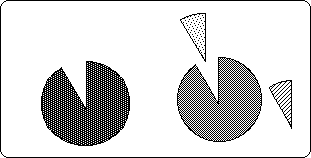
Notice the residue, the piece of pie on the right that is used up, so to speak. When talking about Decaying Averages, this precipitate, this leftover attains significance. {See Decaying Averages Notebook.}
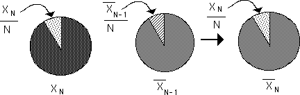
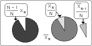
The pie diagram below shows what happens to the new averages when the new Data bit is smaller, the same or larger than the previous average. In the pair of pies on the left, the replacement piece is too small to fill the hole made by the departing piece and so the new pie shrinks to fill the gap. The second pair of pies in the middle is a visual representation of what occurs when the new piece of data equals the previous average – no change. In the third pair of pies on the right, the new piece of data is larger than the average. Not all of it fits in the old pie so the new pie, the new average, becomes larger.
From this diagram it is easy to see that the size of the Nth data piece also has an effect upon the Nth Average. Specifically this shows that the ratio between the Old Average and the New Data has a crucial role in determining the New Average. Following is another geometrical view of Impact.
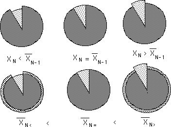
We've seen that the number of elements, N, and that the size of the new Data help determine the New Average. The final element is the Old Average. In the following diagrams the Data size is kept constant and the previous average is varied. The darkest interior area represents the Old Average. The wedge is the New Data. The Number of Bits, N, in the Data Stream, determines the angle of the piece of pie. The angle in radians = 2π/N. The exterior circle around the outside represents the size of the New Average. The dotted donut on the perimeter represents the amount that would be added to the Old Average, the excess of the piece of pie.
It can be easily seen from these diagrams that the size of the new average shrinks as the old average shrinks. If we reverse our vision of these diagrams, i.e. the past average is kept constant and the diagrams are shrunk to keep the growing New Data the same size visually, then we again see that the ratio between the New Data Bit and the Old Average is heavily related to the New Average. {We will see another use for this diagram when we discuss Decaying Averages in the Notebook of the same name, i.e. the growth from Nothing to Something.}
In the series of Pie diagrams above we saw that the New Average is dependent upon N, the number of trials, the Old Average and the New Data Byte. This result was already known from Equation 3 above, listed again below. The Pie diagrams are merely visualizations of this equation, the geometry behind the algebra. {The Pie diagrams are also an introduction to a mechanism of neural networks, which we shall explore in the Notebook, The Emptiness Principle.}
{This equation becomes very important when deriving our equation for the Decaying Average. See corresponding Notebook.}
This equation shows that the New Average is a function of the New and the Old Average. The New Data part is the real impact of the New Data upon the New Average. Similarly the Old Average part is the real impact of the Old Average upon the New Average. The potential impact of the New Data before it enters the picture is 1/N. The potential impact of the Old Average, independent of magnitude, is (N-1)/N.
If N > 2, then the potential impact of the Old Average is greater than the potential impact of the New Data. With each new piece of Data, N grows by one. Hence as our Data Stream grows, the potential impact of the Old Average grows and the potential impact of the New Data shrinks. Each new piece of Data has a smaller potential impact than the Data that preceded it. Note that the sum of the potential impact of the New Data and the potential impact of the Old Average always equals one, because the total potential impact always equals one on any measure. {This will be explored further in the Notebook, Potential Impact.}
Before going on, let us look at a graph of the volatility of the New Average in terms of the relevant measures. The vertical axis represents the ratio between the New Average and the Old Average; hence it represents the percent change that the New Average goes through. The horizontal axis, the X-axis, represents the ratio of the New Data to the Old Average. The X-axis starts when the new Data Bit is 10 times smaller than the Old Average and ends when the new Data Bit is 10 times greater than the Old Average. The lines represent different number of trials, N.
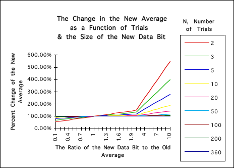
It is clear from this graph that the lower the number of trials, N, the more volatile the New Average is. This is especially true when N < 10. Conversely it is clear that the greater the numbers of trials that the New Average becomes more and more sedentary. When N > 50 the real impact of the New Data is almost negligible, no matter how large or small it is.
Let us take a closer look at the above Graph, eliminating the extreme examples.
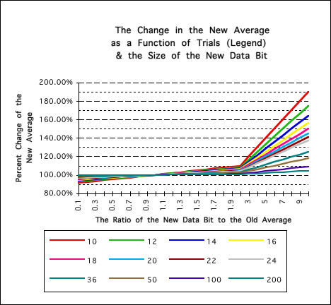
Notice that the potential for growth of the New Average is much greater than its potential for contracting. When the new Data is even 10 times smaller than the Old Average, the New Average is not even reduced by 10%. However when the New Data is over twice as large as the Old Average then the changes in the New Average become much more extreme. Notice again that with the lower values of N that the New Average is more sensitive to change, while with the higher values it is more sedentary.
Instinctively we can see that the momentum or stability of the mean average is very small when N is small and that it is very large when N is large. Remember that Data Streams are always growing. Thus the stability or momentum of the Mean Average grows as the Data Stream grows. Initially the Mean Average is too sensitive. Later on the Mean Average becomes too stagnant. When there are under 10 samples in the Data Stream, the new average is extremely volatile, as exhibited by the above graphs. When there are over 50 Data bits in the Stream, the new average becomes very sedentary. {There is a disadvantage to being too volatile and with being too sedentary. This will be examined in the Decaying Averages Notebook.}
Following is a derivation of the ratio of the New Average to the Old Average. The above graphs are based upon this equation. It shows that the percent of change of the new Average to the Old Average is a function of R, the ratio between the New Data and the Old Average, and N, the number of trials.